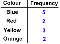
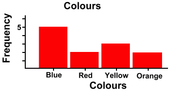
 A bar graph shows you the frequency of each element in a set of data. The height of each bar represents how many of that data element there are. Here's an example. Suppose we bought a small box of Smarties and counted how many of each colour was in the box. We might get results as shown in the table below left. We could then record the frequency of each colour in a bar graph, as shown below right.
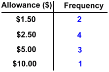
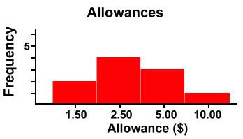
You'll notice that we drew this graph with the bars separated by spaces. We didn't have to do this ... we could have had the bars touching, and this still would have been a bar graph. Below we've organized the data into a frequency table, and then displayed it in a bar graph.
Bar graphs are used to represent the frequency of discrete items. They can be things, like colours, for which there is no particular order. Or they can be numbers, like allowance amounts, where they can be put into order if you choose to. But (this is the important part) the items are not grouped, and they are not continuous. We'll show you what we meant by that last sentence, in the example below, where we show you a set of data that we will group, and display in a continuous manner on a histogram. Suppose we were surveying the masses of fish in a lake, and we caught and weighed twenty-nine fish. We recorded their masses (in kilograms). Below is the data we might have collected. 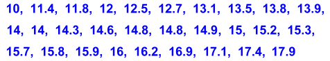 If you examine the data above closely, you'll see that there are a lot of mostly different numbers. It wouldn't make much sense to make a bar graph showing the frequency of each individual mass, since most of the bars would just be one ot two units high, and there would be a lot of bars. Instead we're going to group the data. Grouping means to count how many masses there are in different weight categories, or classes. For example, how many fish had a mass between 10 and 12 kilograms? The answer is three. They were 10, 11.4 and 11.8 kg. Note that we don't count 12 in this class of fish. We're defining 'Between 10 & 12 kilograms' to mean 'everything from 10 up to 12, but don't count 12' Below is our grouped frequency table. We've shown (on the left) which masses went into the count for each class. We also indicated the upper bound of each class in red, to remind you that this value isn't counted in that class. 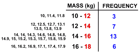 By grouping the data this way, we accomplish several things. First, there will be fewer bars on the graph, and the bars won't all be showing just one or two items. Second, we've made a continuous range of masses. all the way from 10 to 18 kilograms, and every possible mass we could obtain must fall somewhere in this range. Also, because each class runs right up to the next one without overlap and without leaving out any values, the bars must touch. Here's the histogram: 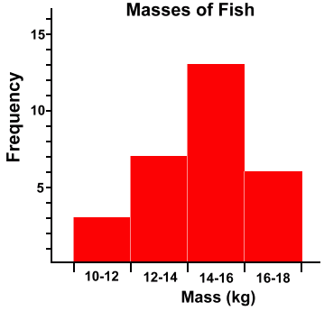 This graph is a histogram, but not just because the bars touch. In the bar graph example at the top of the page, you saw that bars in a bar graph can touch if you want them to ... but they don't have to. Touching bars in a bar graph doesn't mean anything. In a histogram, however, the bars must touch. This is because the data elements we are recording are numbers that are grouped, and form a continuous range from left to right. There are no gaps in the numbers along the bottom axis; every possible fish mass can be located in one of the classes. This is what makes a histogram. ADDITIONAL NOTE: The material on this page follows the Alberta Junior High Math 8 curriculum. There are of course other ways to define and set up classes, and more rigorous definitions of histograms. |