... or any other presentation software
Powerpoint is a powerful tool for presenting ideas, and it's not hard to master. There are other slide presentation software tools available as well, but we'll reference PowerPoint here since it's still widely used, and the principles are the same.
We'll assume you already know how to make a presentation using a program. This page will show you how to make a more effective presentation, whether you're a student completing an assignment, an adult using it for business reasons, or a teacher presenting a lesson to a class. The principles described here apply to any software presentation tool.
An effective presentation is one where your audience can easily grasp the ideas you are trying to get across. Anything that makes it more difficult for your audience to understand what you are trying to say does not belong in your presentation.
With that in mind, here are some tips for making a more effective Powerpoint presentation.
First, the presentation is being given by you; the slideshow is there for visual highlights only. It is not meant to teach the topic, or supply notes to the audience. That's your job.
- 1. Organize!
-
Prepare your presentation just like you would anything else you write. Plan it first on paper by listing the main ideas, and then fill in the points you want to make under each idea. Add an introduction, describing what the presentation will be about. Add a final summary, listing the key points that were covered.
- 2. Choose Colours Carefully
- Your background, which can be either a solid colour or a design, should be a good contrast to the text colour you choose. The aim is to make your text easy to read. If you choose a design template, make it simple and unobtrusive, and use it on all your slides; don't keep changing it.
- 3. Text Size and Type
- Choose a big font that's easy to read. We suggest Arial or Tahoma. Don't try to fit too much on one slide by decreasing the font size, especially if the presentation will be made on a big screen. Use more slides instead.
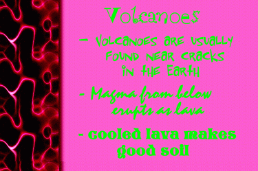
 Here's a sample of what we mean.
What's wrong with this slide??
First, the colour choice is abysmal ... not only do these colours not go together, but you can get a headache just looking at it, never mind trying to read what is says!
Second, the fonts are way too fancy, making them hard to read. Even worse, each bullet uses a different font, which was totally unnecessary.
If you're artistically inclined, you should know better! If you're not, stick to simple contrasting colours and fonts. You want to let your audience follow your ideas easily, not throw up!
- 4. Sentences or Point Form?
- The ideas you present on-screen should be in point form. No-one likes a presentation where the presenter just reads what's on the screen. Your talk should be directed at the audience; use points bulleted on the screen to reinforce what you are saying.
Even if your presentation is meant to stand alone, use point form; it will help you present your ideas more succinctly.
- 5. Animations
- Resist the urge to use more than one animation. Stick to one simple effect (we suggest a 'fly-in' or 'appear') and use it on all your bullets. (Not the title. And don't even consider animating a sentence letter-by-letter!!) The value of making bullets appear one by one is that you can control the pace, and help the audience to focus on what you're talking about. Make sure to set the animation to happen with a mouse click ... you want to make sure it's timed to what you're saying.
- 6. Use Photos, Not Clip-Art
-
People like to look at photographs. Photos can convey a lot of extra information, and do a better job. Clipart is a waste of time. It may make your pages more 'artistically pleasing', but does absolutely nothing for your audience. .
- 7. Sound Effects
-
No! Don't even think of using sound effects to highlight the arrival of your bullets on-screen! Screeching tires and cowbells don't belong in any presentation! Using the same sound effect over and over will drive your audience crazy; using a new one every time will take the emphasis off your ideas ... the audience will spend all their time wondering what sound will come next, instead of concentrating on what you are trying to say. This is a difficult concept for Jr. High students to grasp.
Resources
HTML, graphics & design by Bill Willis 2023
|

 Here's a sample of what we mean.