|
Let's look at a real example. Suppose we consider the case of a math exam written by many thousands of students. After the exam is marked, the average mark is determined to be 60%, and the standard deviation, which measures the spread of the data, is 10%. So we have the mean = 60% and standard deviation = 10%. Here's the graph: 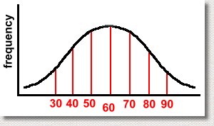 We've shown the mean, which of course is in the center. This means that half the students got a mark above the mean, and half got a mark below it. That's not surprising. We've also shown the marks achieved, ranging from 30% to 90%. We didn't label the frequency axis, so you don't know how many students got any particular mark. Notice that we went up by 10% when we were labelling the horizontal axis. That wasn't accidental ... 10% was the standard deviation. If the S.D. had been 15%, we'd have shown divisions every 15%. When making a normal distribution graph, the divisions of the horizontal axis should be in multiples of the standard deviation. There's a good reason for this, as you are about to find out. Mathematicians have discovered some interesting properties of this graph. Specifically, you can determine what percent of the results occurred between each standard deviation on the graph. Here are the percents: 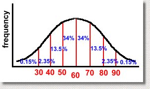 Here's what it means. Notice the value of 34%, between the mean (a mark of 60) and the first standard deviation (a mark of 70). This tells us that 34% of the students scored between 60 and 70 on the test. Similarly, we can tell that only 0.15% of the students scored over 90. The same percent got a mark that was less than 30. Also, 68% of them scored between 50 and 70 on the test. You'll get these results any time you collect data, regardless of what it was about, as long as the shape of the histogram for the data is a 'bell' curve. More importantly, it doesn't matter what the mean and standard deviation are, it works the same way: 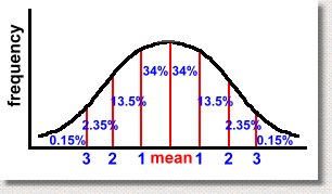 Whatever the mean and standard deviation for your set of data are, the same percents will hold true. If the graph above resulted from measuring the length of every adult's left foot in the province of Alberta, then 68% of the adults would have a foot length within one standard deviation of the mean, whatever it is. We can know this result without even doing the experiment! It always works, as long as the data set is large, and was collected without bias. Another example? Suppose we asked everyone in Canada to measure how far they can spit a watermelon seed. After doing the experiment, we discover that the average distance is 4 metres, and the standard deviation of the data is 0.5 metre. We now can predict that 68% of Canadians can spit a watermelon seed between 3.5 and 4.5 metres! (That's one standard deviation above and one below the mean) By doing small random samples of Canadians using polls, it is possible to predict the mean and standard deviation without actually surveying everyone. This allows you to make conclusions about how people would do, using the graph, without actually doing the whole experiment! Let's get back to our example of the students who wrote the math exam. Here are a few facts we can get from the graph, based on the percents which must hold true. 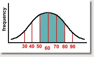 What percent of the students who wrote the test got a mark between 50 and 80? Scroll up the page to see the percents, and then add the appropriate ones. You'll get 34% + 34% + 13.5% = 81.5% So for example, if 5000 students wrote the exam, 81.5% of 5000 or 4075 students scored between 50 and 80. In the graph below, can you identify how many students will have failed the exam? 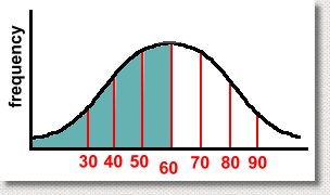 The various percents will add to 50%, because it's everything less than the mean, of course. This indicates another use for the normal distribution graph. By doing the experiment, collecting the data, or giving the test once, you know what the mean and standard deviations are. Then, if you assume you will always get the same results, you can make future predictions easily. In our test example, if you assume that next year's class will get similar results, and you give the same exam, you already know how they will do! And if their results aren't the same, you can look for reasons, because for a large set of data, the results should always look like a normal curve. Just to make sure you get the idea, we have a short quiz which you can try, with answers. The quiz is here ... |