|
The words 'normal distribution' describe the shape of a histogram, or bar graph, you will get after collecting a large amount of data. We are going to explain what the graph looks like, and what you can do with it. When results are gathered, the data will often be shown as a histogram. For very large sets of data, if the data is normal, the shape of the tops of the bars on the histogram, or 'frequency polygon', will approach a 'bell' shape. 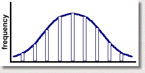 The more data you collect, and the narrower the range of each bar, the closer the curve will approach this shape. From this point on, we won't bother to draw the bars on the histogram, but will just assume that there was a lot of data, and show the frequency curve, like this. 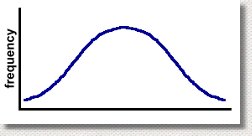 This graph will always be the result whenever data is collected, as long as the number of data elements was very large. This is a surprising result. It means, for example, that if you graphed the marks of all students who write the grade 12 math exam, the graph would look like that. Most students would be near the center of the graph, which is the average, or mean, mark. Very few students have a mark at the low end, and very few have a mark at the high end. This is normal. What is surprising is that you always get this shape, regardless of what data you are collecting. For example, suppose we were to ask 2000 adults at random how tall they were. The data we would get would look just like this: 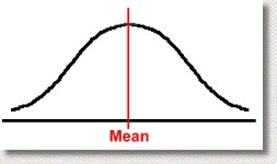 Most adults would have a height near the mean. A few would be very short. A few would be very tall. But the shape of the histogram would be the same. Because this shape will always occur when you collect large samples of data randomly, it's called the normal curve, or a normal distribution. It's sometimes also called a bell curve, because it looks like a bell. Moreover, it has some amazing properties, which will actually let you predict the results of a survey or test before it happens! Let's move on to page two ... |