 Scatter plots are used by researchers to look for correlations. A correlation is a relationship between two sets of data, which can suggest that one event may affect another event. For example, you might want to discover whether more hours of studying will affect your Math mark in school. Perhaps a scientist wants to find out if the distance people live from a major city affects their health. In order to use scatter plots in this way, you must have two sets of numerical data. One set is plotted on the x-axis of a graph, and the other set is plotted on the y-axis. The resulting scatter plot will often show at a glance whether a relationship exists between the two sets of data. 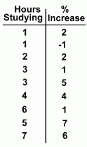 Here's an example. Here's an example.Suppose you want to find out whether more hours spent studying will have an affect on a person's mark. You set up an experiment with some people, recording how many hours they spent studying and then recording what happened to their mark. You can see the data in the table at the right. It's difficult to see any pattern in the table, although it's clear that different things happened to different people. One person studied for 1 hour and had their mark go up 2%, while another person who also studied for 1 hour saw a drop of 1%! If there is any pattern here, we'll have to graph the data to see it. 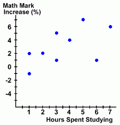 We'll plot the hours spent studying on the x-axis, since it's the independent variable.
The change in the Math mark is the dependent variable, so it goes on the y-axis. The first thing you notice about the graph is that, while the points are scattered around, they do seem to line up. More specifically, they seem to be getting higher as you move to the right on the graph. This type of correlation is called weak positive correlation. - It's a correlation because the points do seem to form a pattern ... in this case, a line. - It's positive because the points tend to get higher as you move to the right. - It's weak because, while the points seem to line up, they do so only weakly. 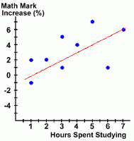 Here is the graph again. We've shown a line that seems to describe the direction the points are heading in. This is called the line of best fit.
 There are methods for determining where this line is, but for our purposes we'll use just two criteria to find and draw the line: - The line of best fit must more or less follow the direction of the points. - There should be roughly the same number of points on each side of the line. Lines of best fit can be used to predict results, especially if you find the line's equation. We'll look at this in more detail later. In our example above you'll notice that very few of the points are actually on the line of best fit. In fact, some of the data points (representing different people) are quite far from the line. You can think of the line of best fit as an average description of what's going on in the experiment. We might conclude that there is a correlation between hours spent studying and a change in your mark, and describe it this way: - there is a weak positive correlation, and it's a line. - as the number of hours of studying increases, the math mark seems to increase. The correlation suggested by the graph is just that ... a suggestion. This does not prove that more hours spent studying causes your mark to go up. There may in fact be some other (uncontrolled) variable that actually caused the increase in marks as the hours spent studying increased. But the correlation tells us that there is some sort of connection between the two, and we may want to investigate further to look for the actual cause, or confirm that more hours spent studying really is the cause. This is the process that scientists go through when they use scatter plots. We'll look at more examples on the next page. Before we do, we should point out that scatter plots can show all sorts of correlations, both positive and negative, and sometimes they can show that there is no correlation at all. Also, the correlation does not have to be a straight line (although linear correlations are the only ones we'll be looking at here). |