 Page Two Scatter plots result from plotting points representing two variables. The closer the data points come when plotted to making a straight line, the higher the correlation between the two variables, or the stronger the relationship. If the data points make a straight line that slants upward to the right, then the variables are said to have a positive correlation . If the line slants downward, the variables have a negative correlation. 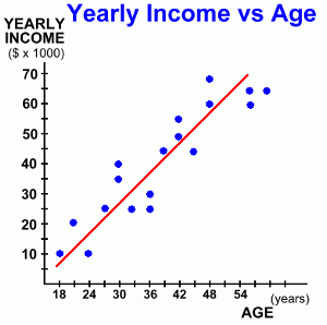 Here's another example:
The graph at the right illustrates how a person's job income changes as they get older. Like our previous example, there is a linear positive correlation ... as a person's age increases, so does their income. The line of best fit follows the direction of the points. There are roughly the same number of points on each side of the line. While this is still a positive correlation, it's a bit different than the last example. Here the points are much more obviously following a line. This is an example of strong positive correlation. The stronger the correlation (the more closely the points form a line) the more likely there is some connection between the two variables. Now let's look at how we can use this graph. 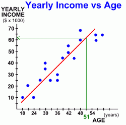 Suppose we wanted to predict how much a person's income would be by the time they reach the age of 51. There were no actual results for that age in our data, but even if there were, we wouldn't use them, as individual data points can vary widely. We're looking for some sort of average answer.
The line of best fit gives us such an 'average'. It shows the trend to increasing income as a person's age increases. To find out an approximate income for someone who is 51 years old, we read the value from the graph: - Find age 51 on the x-axis. - Draw a vertical line up to the line of best fit. - Draw a horizontal line from there, back to the y-axis. This gives us the income of someone who is 51 years old ... approximately $61,500. Here's one more example. 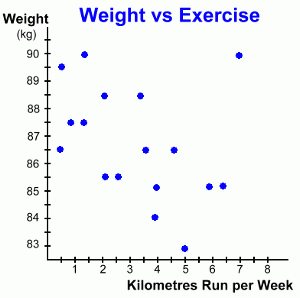 This time the data we've graphed illustrates how a person's weight might change depending on how much they run in a week. It records the change in weight for a group of people, all of whom started out weighing 90 kg, and each of whom runs a different number of kilometres each week, for an unspecified period.
Can you see the difference in this example? Here, as the kilometres run each week increases from person to person, the weight of each person seems to decrease. This is an example of a weak negative correlation. It's negative because as the number of kilometres increases, the weight decreases. It's a weak correlation because the data points line up only weakly. Our conclusion might be that as the number of kilometres run each week increases, a person's weight decreases. 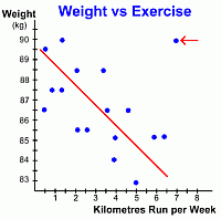
Here's the same graph with the line of best fit drawn in. Notice once again that the points only 'sort of' line up ... that's why it's a weak negative correlation. But notice also the point in the upper right of the graph (red arrow). This data element is an anomaly, called an outlier. It doesn't fit the pattern of the other points, and we didn't use it when drawing the line of best fit. But we still have to explain it. Why is it there? This anomalous point represents one person who ran 7 km every week, but whose weight stayed at 90 kg. We might search for an explanation, perhaps even interviewing that person, and discover that the only food that person ever eats is fatty fast food ... thus explaining their lack of weight loss! 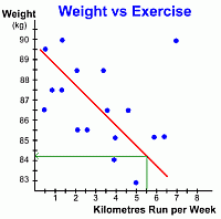 Again, let's look at how we can use this graph to make predictions.
Suppose we want to estimate how much weight a certain 90 kg person will lose if they run 5.5 kilometres every week. By locating 5.5 km on the x-axis, and drawing lines up to the line of best fit and over to the y-axis, we can read the answer off the graph ... it looks like the person's weight will drop to about 84.2 kg. It's important to reemphasize that predictions based on data like this are made using the line of best fit, not individual points ... and the predictions are only estimates. If you wanted to make a prediction about a data value that is well off the edge of the graph, you will have to do some work. One alternative would be to extend the graph carefully so that the line can be drawn far enough to make a reading possible. Another alternative is to find the equation of the line of best fit. Once you know its equation, it is an easy job to calculate the values of as many points as you want. This is a Math 10C topic; these students can see the methods for finding the equation of a line. Now that we've seen some examples of scatter plots and how to use them, let's look at all the types of linear scatterplots you are likely to see; go on to page three ... |