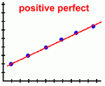
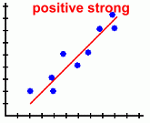
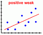
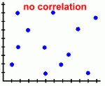
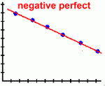
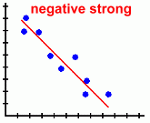
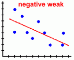
 Page Three Here are the types of scatter plots you are likely to see:
Scatter plots are most useful when there is a large number of data points. Here's what they tell you about the relationship between the two variables:
When a scatter plot shows a correlation between two variables, even if it's a strong one, there is not necessarily a cause and effect relationship. Both variables could be related to some third variable that actually causes the apparent correlation, or there could be some other cause. As well, an apparent correlation simply could be the result of chance. Here's an example where an apparent correlation is actually the result of a hidden third variable. "Mr. Jones gave a math test to all the students in his school. He made the startling discovery that the taller students did better than the short ones. His conclusion was that 'as your height increases, so does your math ability' ". Of course, the hidden variable here is the age of the students, or the grade level they're in. Mr. Jones gave the same test to every student in grades one through twelve, so of course the students in the higher grades (who have learned more math) did better on the test. It wasn't the increase in the students' height that caused the math results to go up, but their increasing grade level. Scientists who use scatter plots to look for correlations between things have to watch out for this hidden variable problem. Here's a good example: An American medical researcher wants to see if there is a link between a person's socio-economic status (how well-off they are) and certain types of cancer. His research seems to indicate that there is a link ... rich people seem to suffer from more cancers than poor people do. His conclusion is that being rich will make you more likely to get cancer. His rationale for concluding this is that the stress that comes with high-paying jobs could be a factor in causing some cancers. Sound logical? The connection the researcher described may actually exist, but there are certainly other possibilities. In the United States there is no universal free medical care, so rich people are far more likely to see a doctor than poor people. The higher rates of cancer in rich people may not be due to their wealth at all, but due instead to the fact that they visit their doctor more often (they can afford it), so more cancers are being diagnosed for them. People who write articles for newspapers and magazines are often unaware of the fact that a correlation may not in fact represent a cause-and-effect situation. For example, have you read about how violence against women seems to be on the increase? It's certainly more evident in the media than it ever was before. In fact, there is no way to justify this conclusion, since (unfortunately) it has only recently been seen as socially acceptable to report such abuse ... in the past almost all violence against women (particularly by their spouses) went unreported. So there is no reliable way to see if there actually has been an increase. You should be starting to see how scatter plots can be used in a wide variety of disciplines, not just in Math class! You'll run in to them in Science, in Social Studies, in Economics, and certainly in Politics. Finally, let's look at some real-life examples of scatter plots being used. Go on to page four ... |